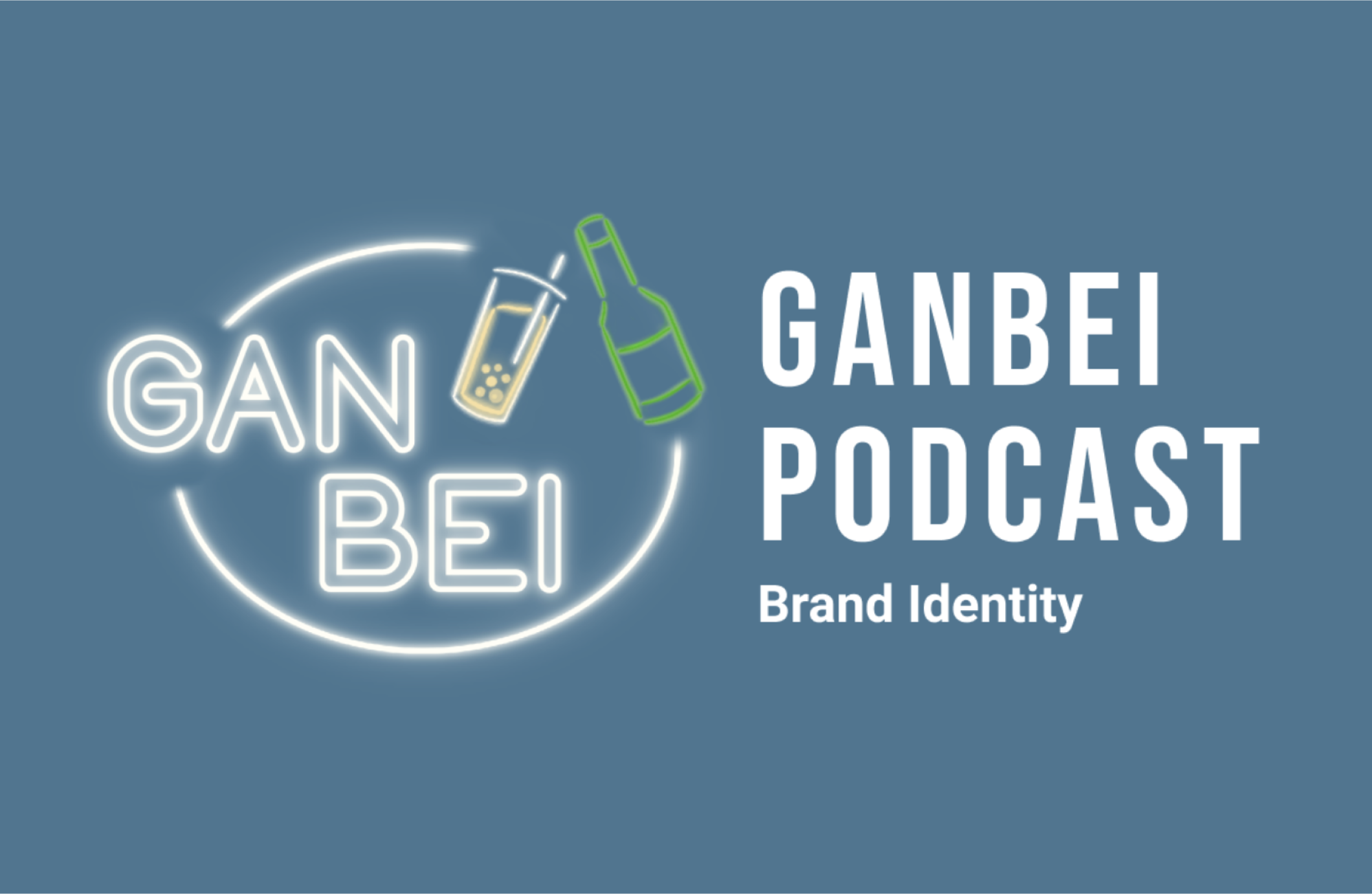
A podcast channel from RYSE Network, a Facebook organization focused on creating opportunities to network and connect among Asian communities. Hired to create a set brand deck and visual guide for the podcast's content.
My Role: Visual & Brand Designer | Tools: Figma, Procreate, Adobe InDesign | Timeline: 2 Weeks
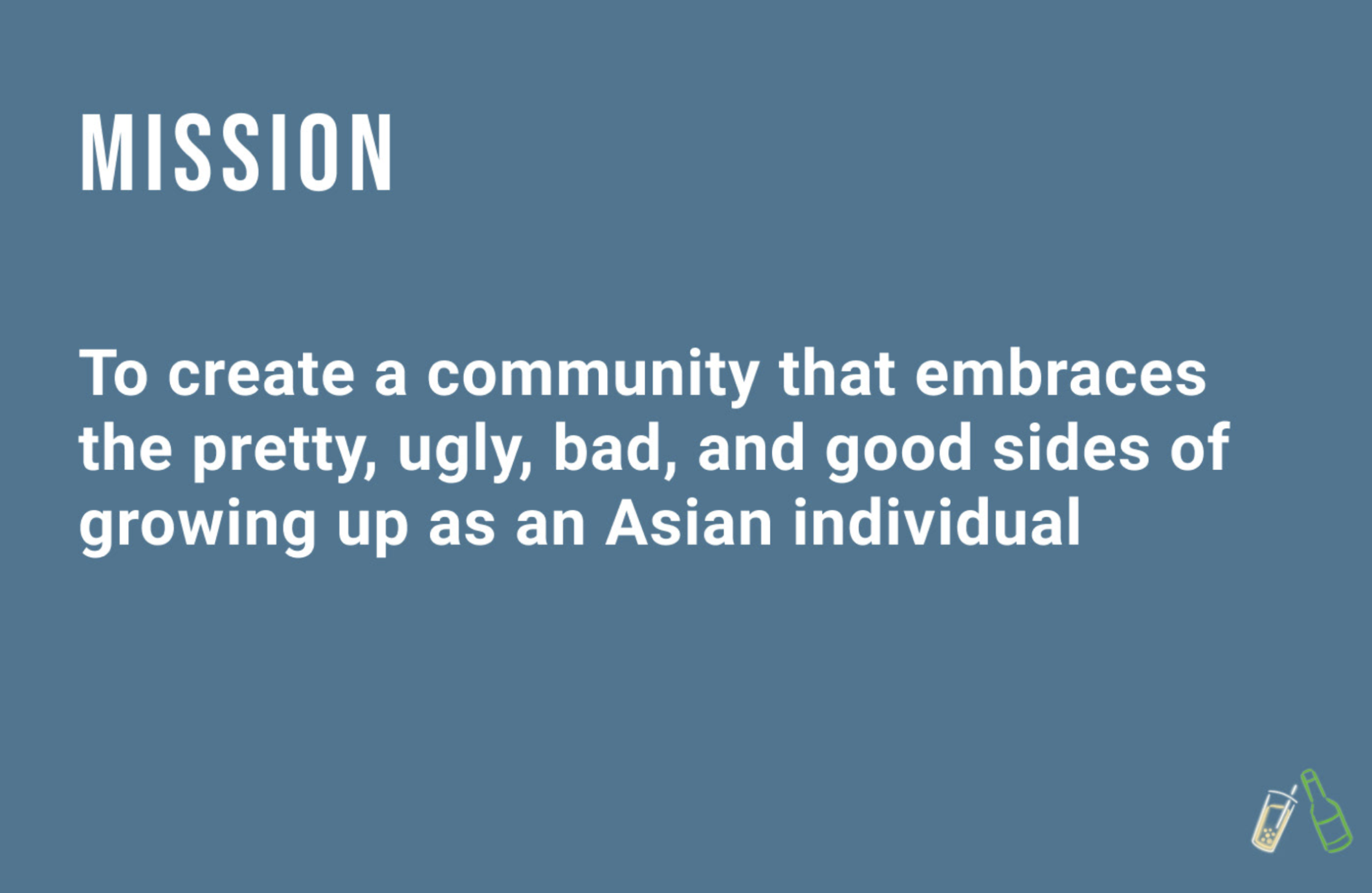
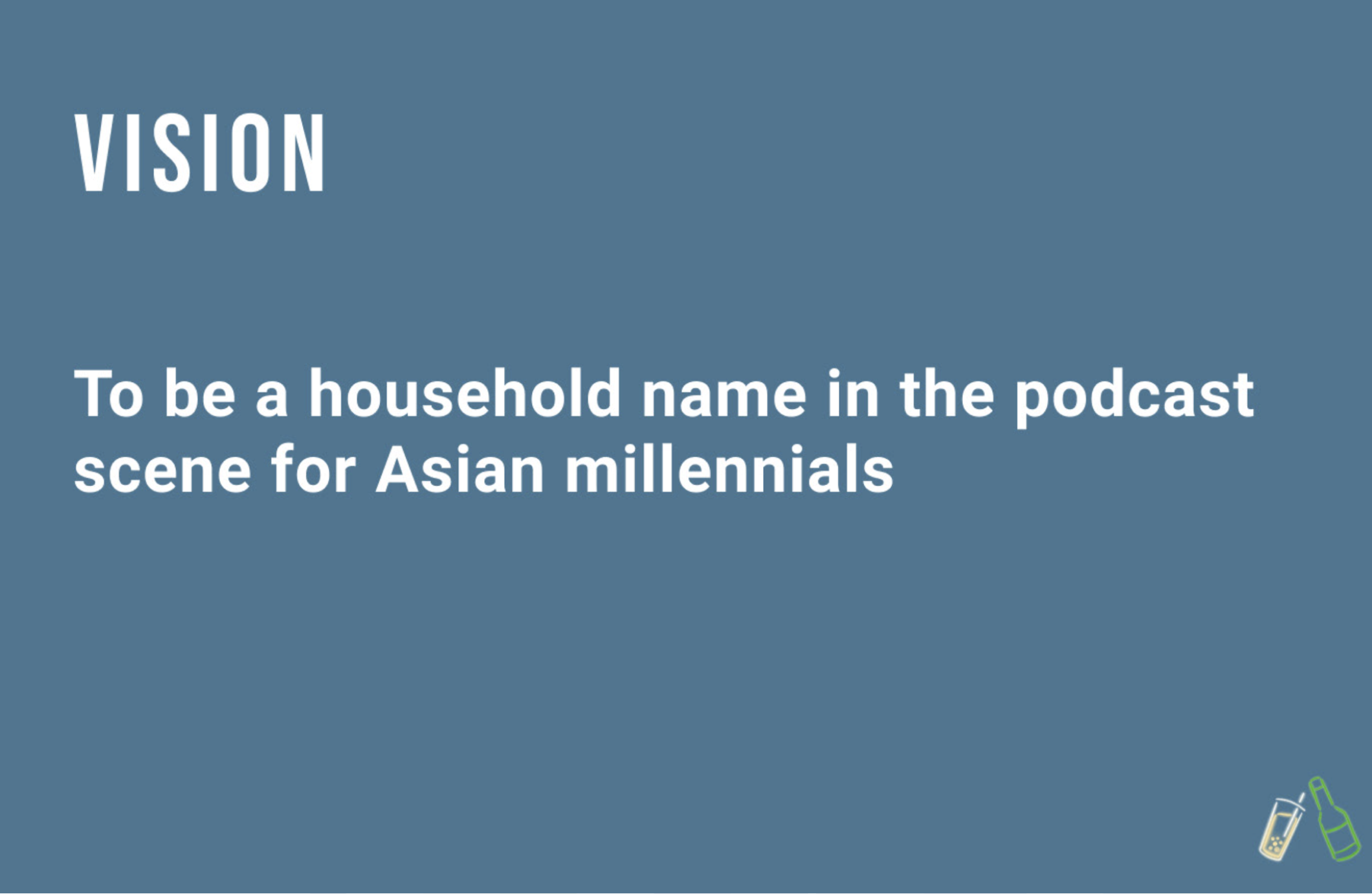
The objective was to rebrand the podcast in order to promote its content. I listened to their concerns, inspirations/visions, and goals for the podcast then incorporated various aspects to present a visual brand deck that conveyed their message.
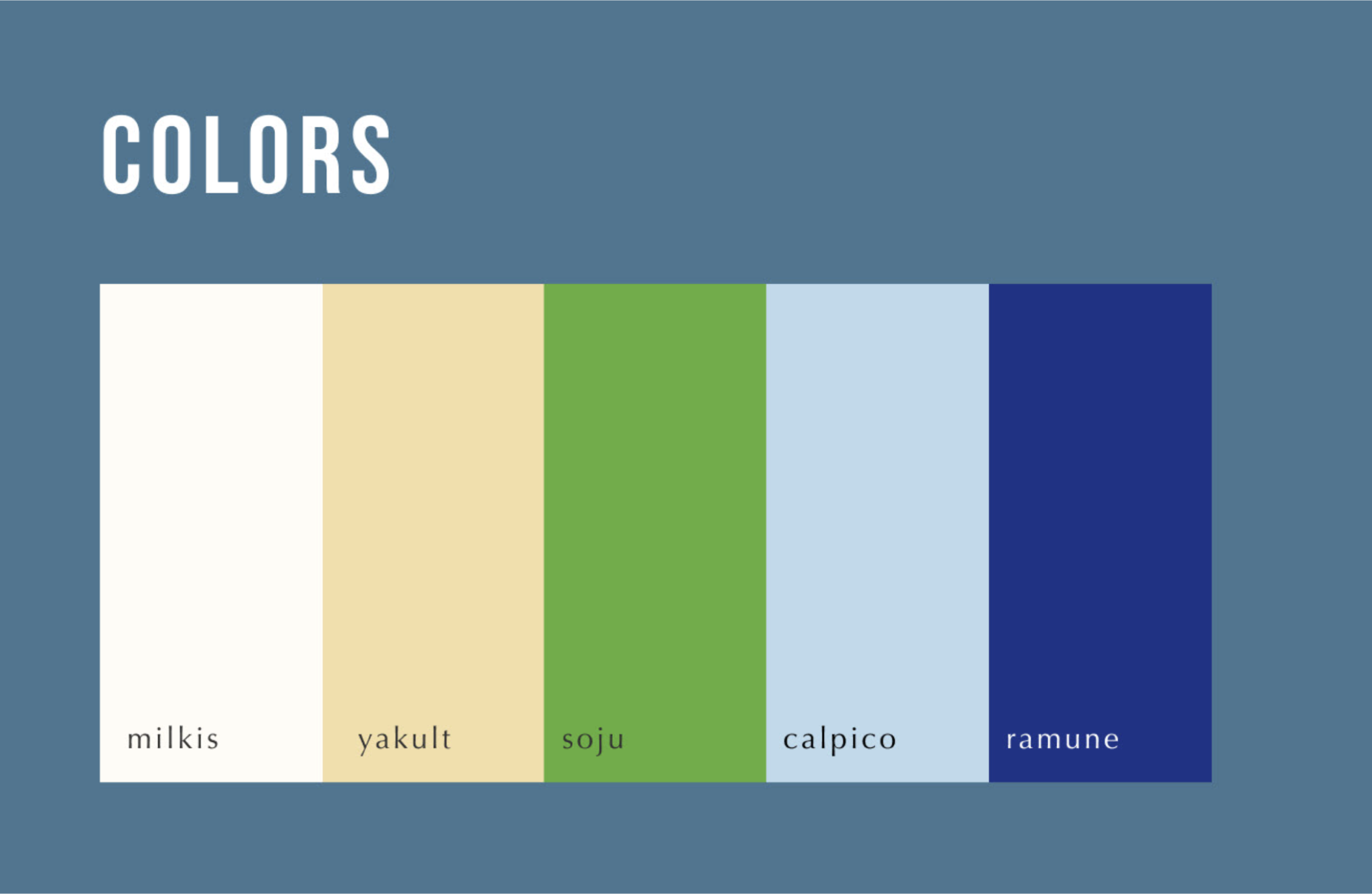
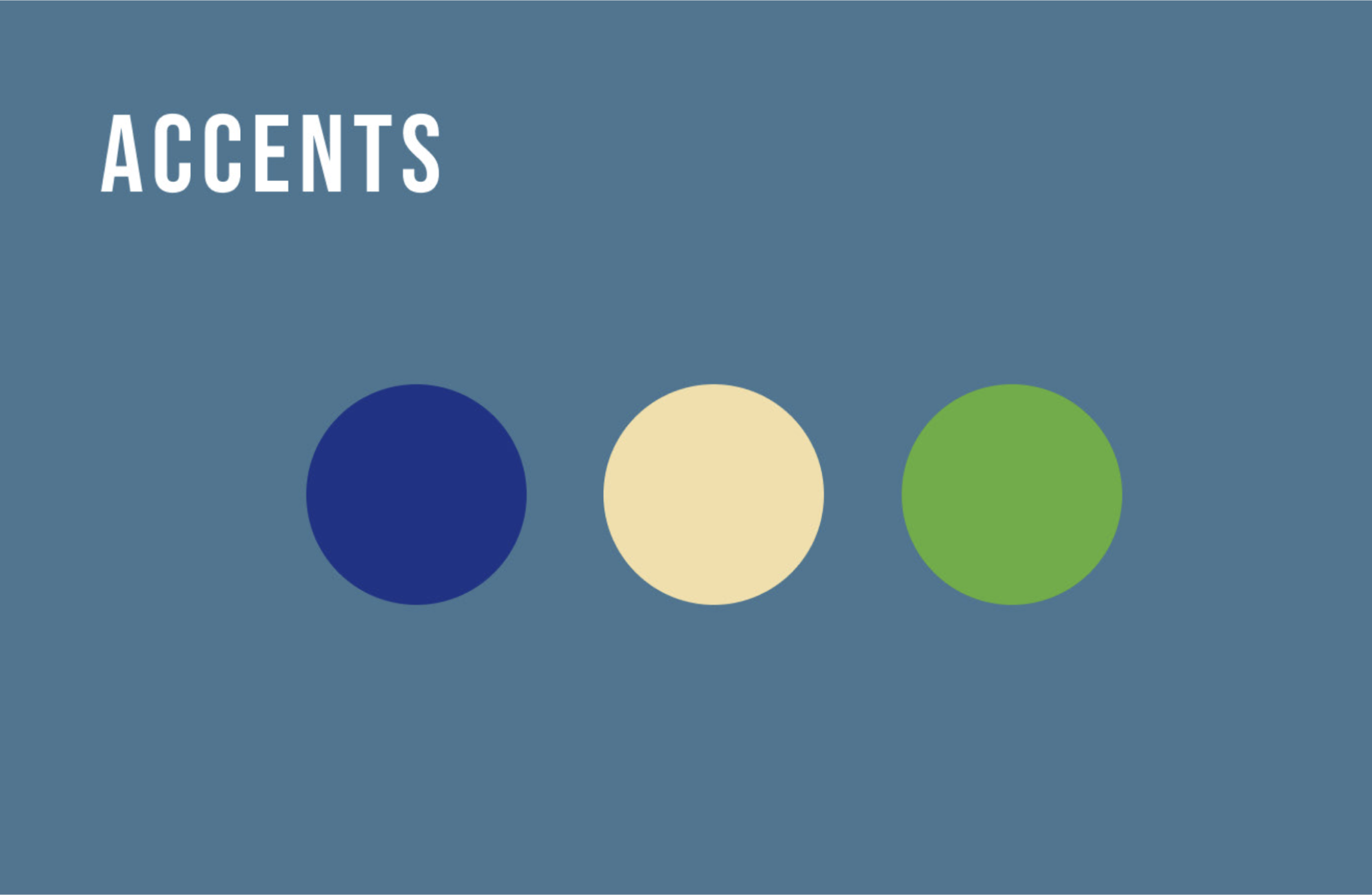
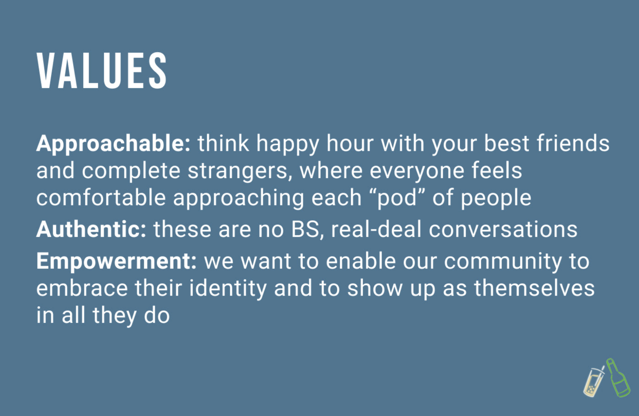
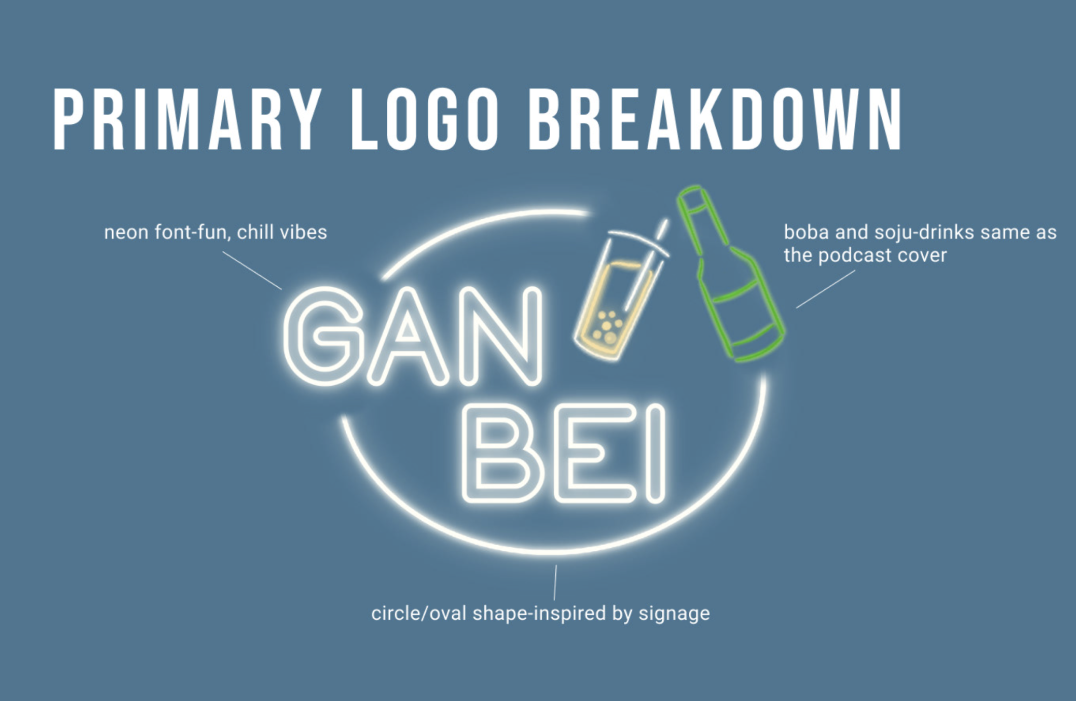
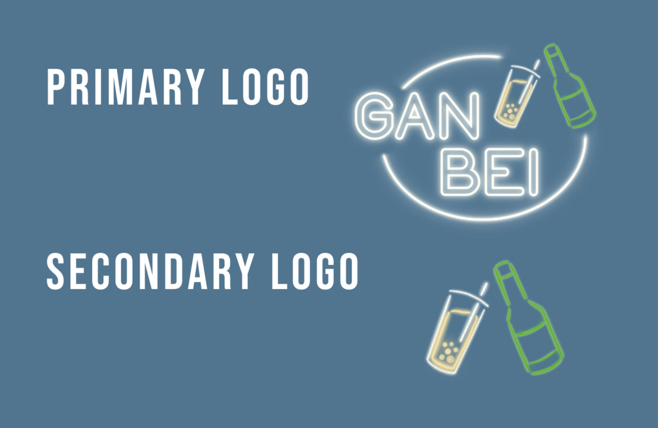
Since this podcast focuses on the Asian community, I created a color palette inspired by popular Asian drinks. I focused on cool tones to emphasize one of the podcast’s values: approachability, giving a sense of familiarity in an Asian American community. The types of beverages also correlate with the title of the podcast “Ganbei” which is said among a drinking setting.
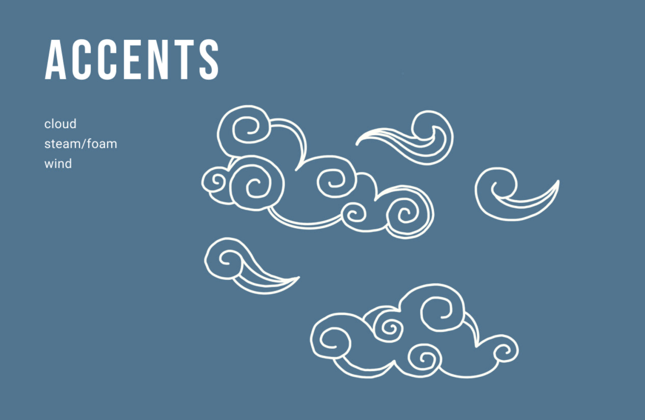
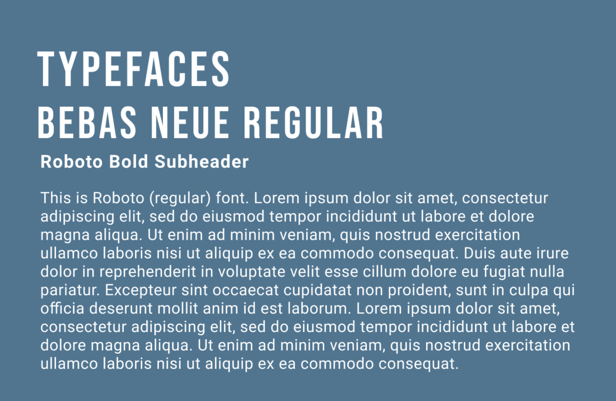
The hand-drawn feel of the accents is inspired by traditional Asian art. By utilizing organic shapes, it shows how free-flowing and raw these talks are. It presents the podcast’s authenticity and empowerment of the topics discussed in these conversations. Since the colors and accents are the focus of the brand and what it conveys, the typeface is kept minimal and straightforward to be seen clearly and easy to read.

 BackNext: GE